
Continuing the blog serialisation of my popular X-Pro Series lust/hate/love story:
Part 128: The X-Pro2 and Colour Options
So after last week’s article about the X-Pro2 and monochrome options… who’s surprised that this week’s article will be something similar but about colour? 🙂
Last time I offered my opinion that when it comes to black and white conversions we’re best served by de-saturating the colour channels and finding our own look on a picture by picture basis.
This is in no way a criticism of anyone who wishes to simply select one of the Fujifilm native film profiles for their work and certainly isn’t any sort of criticism that Fujifilm offer us so many monochrome and colour options
The point I was making is that by taking ownership of the black and white conversion process we get a grassroots chance to add our own soul into the resultant image.
If a Fujifilm pre-set (or a VSCO, or a RNI, or a DXO Film Pack, or an Alien Skin one etc etc) perfectly encapsulated your vision for the photograph then I think this is fantastic.
My personal opinion here is that if you’re happy with (say) bog standard Velvia then use it, it’s slightly twee to force a change into our workflow simply to say that we’ve done so, and I think it’s only really worth chasing a look if we feel that the incumbent options aren’t quite working out for us.
I’ve written enough articles now about the X-Pro1 Vs the X-Pro2 and hacking X-Pro2 RAFs to change the colours and tones to indicate to me (and you) that I could be happier with how the colour files from the current generation of X-Trans sensor arrive in my RAW editor
But colour is a little more complicated to mess with than monochrome. Black and white immediately demands that the viewer willingly suspends disbelief (as humans don’t see the world in black and white) and the colours of many things look very wrong, very quickly if we wander outside of what we perceive them to be (think green grass, blue sky, skin tones)
One of the reasons I use SilkyPix for Fujifilm RAFs is that this application offers many different (non-fuji) colour profiles and it can a rewarding starting point.
But as I wrote above, sometimes we need to find our own path with our work, and as much as it’s a great labour saver when something from a drop down menu does the job, I like to think that in cases when we’re less then inspired by native options, we need to ask ourselves what we want the look of the colours of the photo to achieve, how it fails and what we can do about it.
So for this week’s article we’ll be looking at three images, (selected for their colours) and I’ll give you an overview of some of the things you can do to tweak and change the way they appear.
Let’s start off with the three images as I’ve PP’d them


You may very well not like these edits at all 🙂 that’s fine. But my point with them is that they don’t look like anything that’s coming out of the X-Pro2 natively!
These are all edited in SilkyPix Pro v8 with one of their native colour profiles
But what I want to do today, is too show you some modifications that can be done to the OEM Fujifilm colour profiles.
We’ll be using Classic Chrome for this, which is a film sim that I’m moderately ambivalent towards (is that an angry mob I hear at the door? 😉 ) but many of you seem to adore.
So let’s start off with a baseline, which in this instance would be the RAFs (using the same PP as above) but with zero colour changes, SOOC AWB and CC applied.


Which ever way your personal taste goes between the pairs of images, I’m sure you’ll agree there’s quite a difference!
Now let’s stick with CC, but this time apply colour changes.


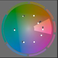
The only changes set between the two sets of CC images have been WB, WB colour cast and Colour wheel modifications
The WB changes have seen set as a custom setting based on how I want each image to look (or at least the changes I want to show you, in other words I’ve used the eye dropper tool on various grey points to find a look I liked, then used SilkyPix colour cast tool to set a mood to each photo. This is a way of working that I don’t pre-set, personally I feel that this is best done on a picture by picture basis.
The main change has been to add in the saturation that CC lacks and apply a base colour wheel modification that I use a starting point.
So for my view at least, modifying colour follows a similar workflow as it does monochrome, the work is in the colour channels, their luminosity, hue and intensity (although for black and white you’re only really changing the luminosity)
Classic Chrome belongs to Fujifilm. Happy with it straight out of the gate? Good. Rejoice.
But I hope that today’s article has shown you that you can add own your twinkle to Fujifilm’s colour science.
======================================
See more of my work on Instagram and Flickr
======================================
A lot of time and effort goes into this site.. Hopefully it’s helped you? Perhaps you’d consider helping me?
One way you could help me is if you want to buy from Amazon, if you do so using the links below, then I will receive a small percentage of your expenditure, and you will pay NO MORE than you would have paid anyway.
Shop at Amazon USA
Fujifilm X-Pro2 ¦ Fujifilm X-Pro2 Handgrip
¦ Shop for Fujifilm X-Pro
¦ Shop for Fujifilm X-T
¦ Fujifilm XF Lenses
¦ Fujifilm XF Acessories
Shop at Amazon UK
Fujifilm X-Pro2 ¦ Fujifilm X-Pro2 Handgrip
¦ Shop for Fujifilm X-Pro
¦ Shop for Fujifilm X-T
¦ Fujifilm XF Lenses
¦ Fujifilm XF Acessories
If there’s a different product you’re considering, then perhaps you’d drop me a line and I can send you an associate link for it?
Another way you could help, is by making a donation. The donate button can be found on the link below
Thank You Very Much!
======================================

I like Velvia best.
LikeLike
Brighter colours are usually best 🙂
LikeLike